 severak
17.12.2018 09:43:56
While this sort of work is cool and interesting, and I give away high-resolution versions of it for free, I can only do it when I take time away from my regular paid client work. If you derive some value from what you’ve seen here, you are welcome to make a donation to support my continued efforts.
This is my father’s manual typewriter, a Royal Safari II. Or maybe it’s mine — I appropriated it quite a long time ago.
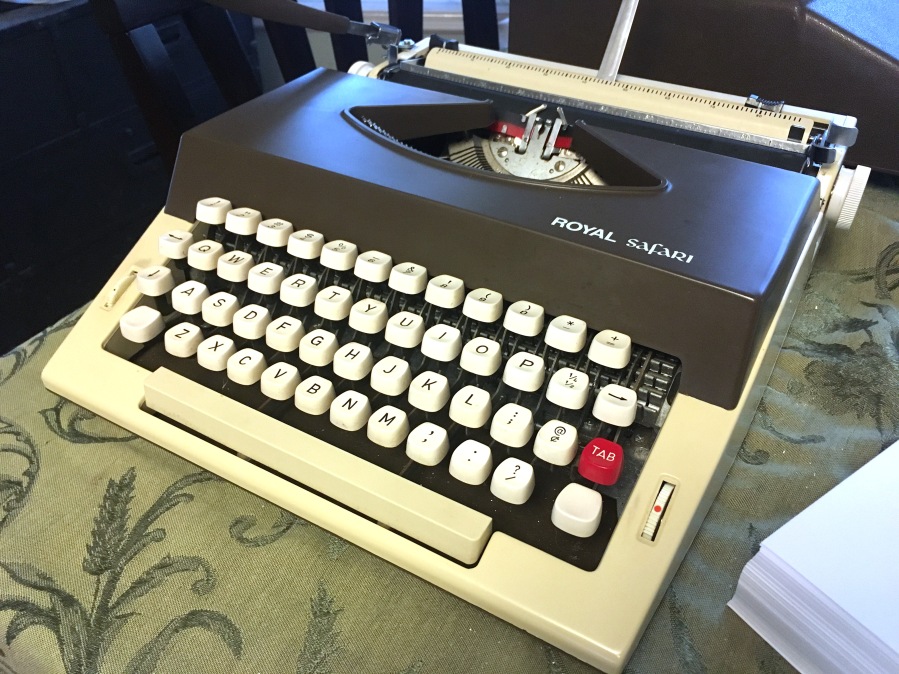
I remember playing with it a bit as a child in the 1980s, but for the most part I’ve rarely used it. But I’ve kept it around anyway, because I’ve always had a nostalgia for old technologies. Maybe I liked the idea of being a person who owns a typewriter.
A couple of weeks ago, I remembered that it was in the basement, and I thought — as I do from time to time — about how nice it would be to have a reason for using it. And then it occurred to me that I should just go with my default reason: maps.
After a few hours of planning and typing, I managed to create a typewriter map and I put it out on Twitter, where it ended up being by far the most popular thing I’ve ever put on that platform. Or probably ever, anywhere.
It’s probably of no surprise to anyone who’s known me for more than five minutes that I chose to start this project by mapping my homeland in the Great Lakes. I think it’s always useful to begin with somewhere familiar when trying something new, because you can use your local knowledge to confirm whether or not the technique is doing justice to the place.
Click here if you want to see a giant high-resolution scan. It’s full of smudges from the ribbon, alongside errors corrected with a generous application of Wite-Out. But I’m quite pleased with its messy, organic, analog nature. Other seemed to be, too.
I hadn’t expected such a warm reception from the internet, but even before that happened, I had considered my experiment a success. So I followed it up with a couple more maps, to get a feel for some different styles. You can click on either of them to have a look in more detail.
It was an interesting diversion from the digital precision of my normal workflow. Sometimes fun, sometimes frustrating, but in any case a chance to mess around with some new challenges.
The ideas here aren’t new. John Krygier has a post about typewriter mapping. Early computer graphics, such as ASCII art, along with early mapping software (like SYMAP), use essentially the same style as what I am doing (though mine is much more rudimentary): constructing images through individual characters.
In any case, now that you’ve seen the maps, read on to learn more about the challenges and decisions that went into their creation.
Map 1: Rivers of Lake Michigan
Though I just called this project a “diversion” from a digital workflow, all of these maps actually started on the computer. For this particular one, I began with a grid in Adobe Illustrator. Each rectangle in the grid represented one character position on the typewriter. There are ten characters to the inch, at an aspect ratio of 0.6. The final grid was 75 × 60, which would fill a 7.5″ × 10″ space.

Atop that, I dropped some data from Natural Earth. And from there, I began “tracing”: plotting out which characters I could type to represent the rivers and coastline, and where each one should go.

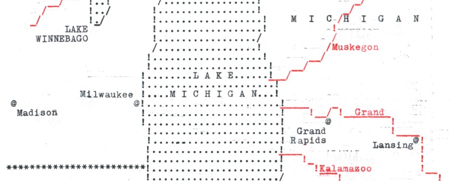
After a little experimentation, I decided that if I wanted to draw linear features, there were three characters that were best to use: ! / _. Together, I could create rudimentary lines that roughly connected together in a pseudo-vector style, even if the typewriter grid itself is basically a raster.
A backslash (\) would also have been great, but that was a character invented pretty much exclusively for use on computers, so it’s not found on my typewriter. As such, I had diagonal lines that sloped somewhat cleanly in one direction, while they stairstepped back down in the opposite direction. Compare the coastline on both sides of Lake Michigan, below.

For the state boundaries, I decided to try something different. I simply filled a bunch of “pixels” in with asterisks, rather than using more “linear”-looking characters. A raster, rather than a pseudo-vector, approach. It creates a small visual distinction between the boundaries and the coastline, which might be pretty hard to do otherwise. There aren’t a lot of symbology options in a situation like this.
The biggest of those options, though, is color: my typewriter has a two-color ribbon, so I tried to make the most of it by setting the rivers off in red. This also helped with a labeling problem: I could name the rivers in red, to distinguish them from any other features. Other than color, though, the only way to vary my labels was to set some in capitals, and some in title case. I’m used to labeling most every class of feature on a map in a different style, but that’s just not possible here. My islands and my cities, for example, look the same (black, title case). The states are lakes are the same, too (black, capitals).
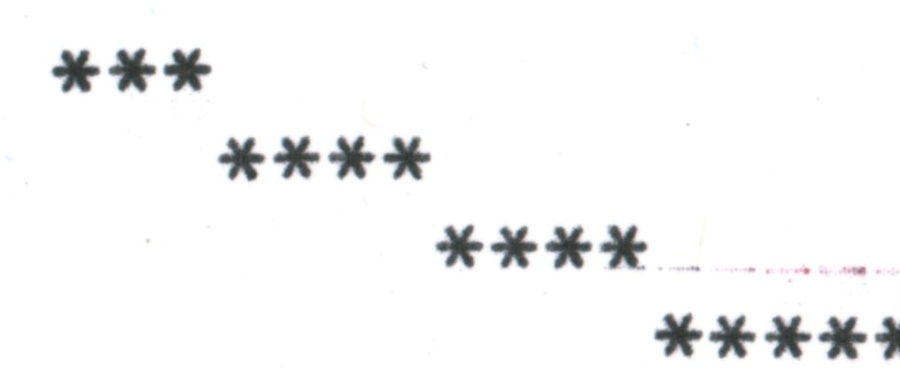
Once I had spent a couple of hours or so on developing a plan, it was time to start typing. I loaded some paper into the typewriter and got to work. At first, I proceeded very linearly: left-to-right, top-to-bottom. But that was tedious. There’s a lot of white space in this pattern, so sometimes I was forced to hit the space bar a few dozen times to advance to the next character on the line, and there was always a chance I might miscount and make a mistake. More importantly, though, following this workflow revealed a problem with my typewriter. Whenever I hit the carriage return lever to go to the next line, there was a chance that I’d somehow get a misalignment. Have a look at these patterns I typed:

Notice how the characters don’t all line up along the left side, but then become more aligned on the right? I’m not sure why it kept happening, but it seemed most often to appear when I would use the carriage return lever. So, instead, I shifter to a different style of typing. I would start to trace features somewhat linearly. For the top left part of the map, for example, I began by typing three asterisks, then I manually moved down one line, then typed four more, then moved down another line, and typed four more, etc. following the line of the state border.
I manually moved the paper up and down and used the backspace and spacebar keys to align myself to where I needed to be at any time. In this way, I mostly avoided misalignments, though smaller ones still kept creeping in. About three-quarters of the way down the page I got a minor leftward shift that you can see in the final product. You can also see where I typed some periods over again to check if it was just my imagination or if it really was misaligned.

Fortunately, it wasn’t enough to ruin my work, but it was a constant danger, and something I am still trying to figure out.
The final product has various interesting smudges where the paper accidentally contacted the ribbon. In particular, I noticed that typing in red always produced a faint black “shadow” a couple of lines above. When the slug hit the red part of the ribbon, a small portion of it would lightly hit the black portion of the ribbon, too. Later on, I started holding scrap paper over my map in order to prevent this, so that the black shadow would go on the scrap.
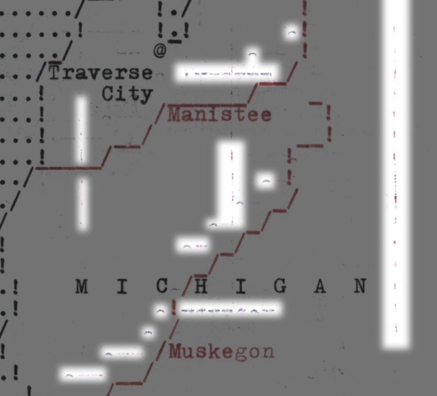
In sum: my typewriter is not a precision instrument. This makes it a somewhat uncomfortable-feeling tool for a detail-oriented designer like me. I like being able to zoom in to 64,000% in Illustrator and correct errors that are small enough that no human eye could possibly ever see them. But, there’s something attractive about the organic messiness of the typewriter.
Once I was done, I scanned it, and then turned it over to the Robinson Map Library, since I wasn’t sure what to do with it now that I was finished. So, come to Madison if you ever want to see the real thing (this goes for all three maps).
Map 2: Shadow Contours

For this one, I wanted to try and see if I could squeeze some sort of terrain representation out of the typewriter. As I mentioned, early digital graphics used printed characters to create images. And shading could be simulated by using characters of different darkness. The ASCII Art page on Wikipedia has some examples of this.
My goal was to do something like illuminated contours: lines that would get darker on the lower-right side and lighter on the upper-left, to create a depth illusion. So I needed to do something rather like what John Nelson calls “Aspect-Aware Contours.”
Setting this one up required a whole different workflow than my first map. I began with a DEM of Michigan that I always keep on my Google Drive, ready to test out a terrain technique at a moment’s notice:
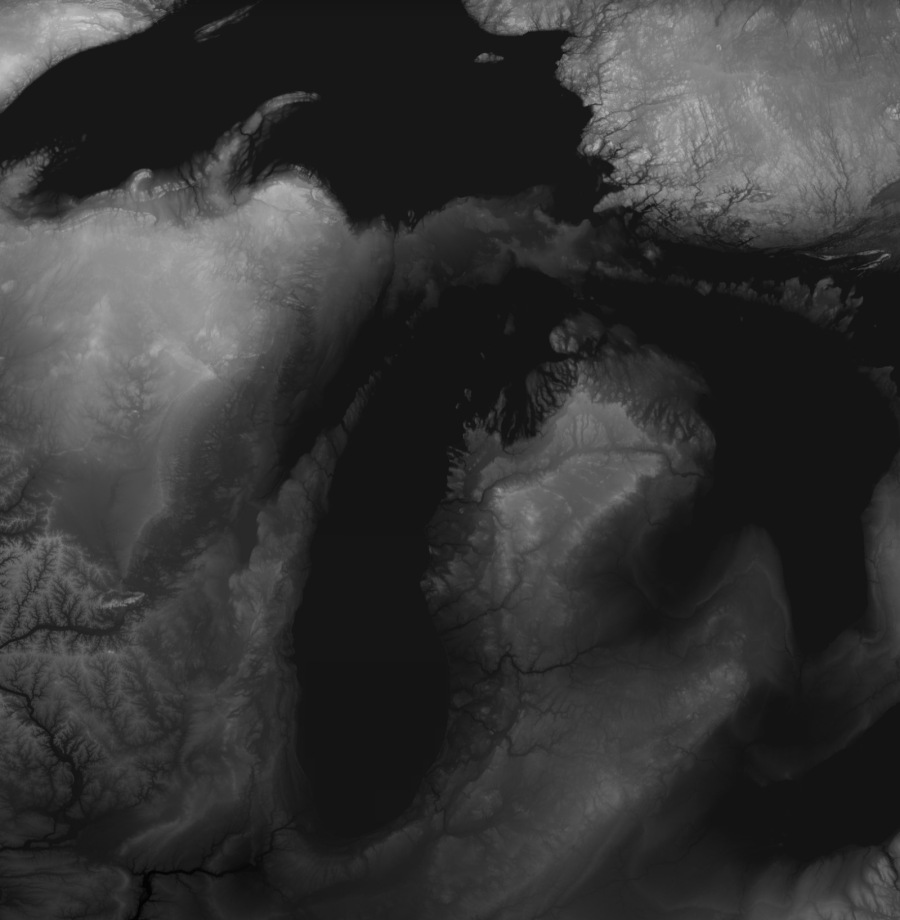
First off, I cropped and shrank it down to 75 × 100 pixels. Then I further compressed the vertical dimension to 60 pixels. These two separate steps were necessary because the pixels aren’t square on my typewriter, as we saw in the grid earlier: they are taller than they are wide. I needed something that had the same aspect ratio as a 75 × 100 image, but once I had the overall image aspect ratio correct, I needed it to really only use 60 characters vertically, since each character is so tall. In the images below it looks a little squished because it’s being shown with square pixels. But in the end it stretches back out correctly.

From there, I classified it into just a few elevation levels, and smoothed them out a bit via a median filter.
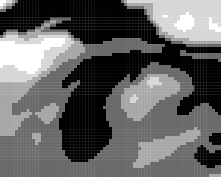
And then it was time to calculate the aspect of each pixel in the raster.

Flat areas have no aspect. Pixels on the boundary between elevation classes, on the other hand, are assigned values based on which direction they are facing. So, now I could tell which areas would be in shadow (facing toward the lower right), and which would be lighter (facing upper left). No, I didn’t compensate for the vertical stretching when calculating aspect, but I should have.
The aspect calculation produced a double line of pixels, one on each side of the boundary between classes. But I really only needed a single line of pixels to represent the contours, so I first cleaned those up. And then I grouped the various aspects into three shades: light, medium, and dark, based on the particular direction they were facing.

Now I had contours with some shading. All that was left was to turn them into individual typewriter characters. I converted this raster into an ASCII file, which looks like this:

Each pixel is represented by a number, and there are four numbers: one for light, one for medium, one for dark, and one for white. From there, it was simply a matter of doing a Find & Replace in a word processor to convert them to the three shading characters I had chosen to use: . + $.

And from there, it was just a matter of typing things out on the typewriter.
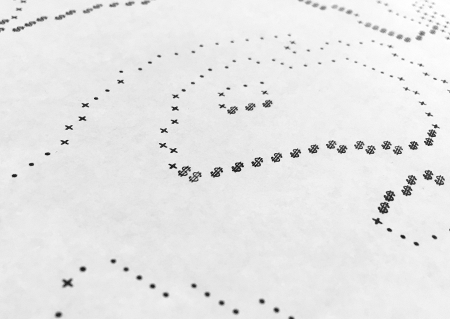
I tried a couple of other variations on this idea, as well. I initially hoped to do a proper set of Tanaka contours, with a medium-grey background and white highlights. But the white areas weren’t obvious enough amidst all the typed characters, so it wasn’t working.
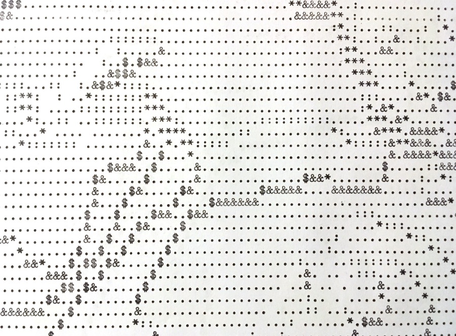
Keeping white as the background color helped a lot, so I decided to go with contours that started with at least some darkness to them even on their light side. I also tried doing it with five different shades: . : + & $.
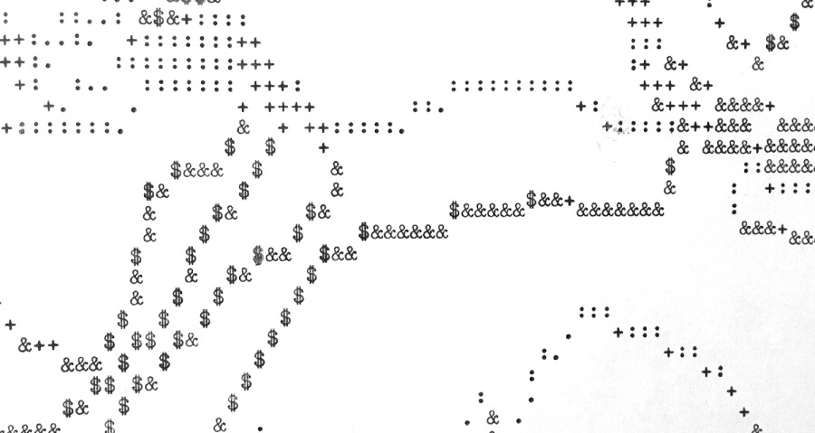
However, I think that was too many — the distinctions aren’t really sufficiently clear between some of them, especially when each character varies so much in darkness just based on how hard I hit the key. So, when I had to halt that particular attempt partway through due to me misreading part of my pattern, I decided to start over with a simpler set of three characters. I reclassified the aspect analysis and re-converted it to characters, and that became the basis of the final attempt described above.
Map 3: Shaded Relief

Since I had been at least modestly successful applying shading to contours, I decided finally to see if I could render a rudimentary shaded relief on the typewriter, as well. I knew it wouldn’t look particularly realistic, but I was hoping it would at least be sufficient.
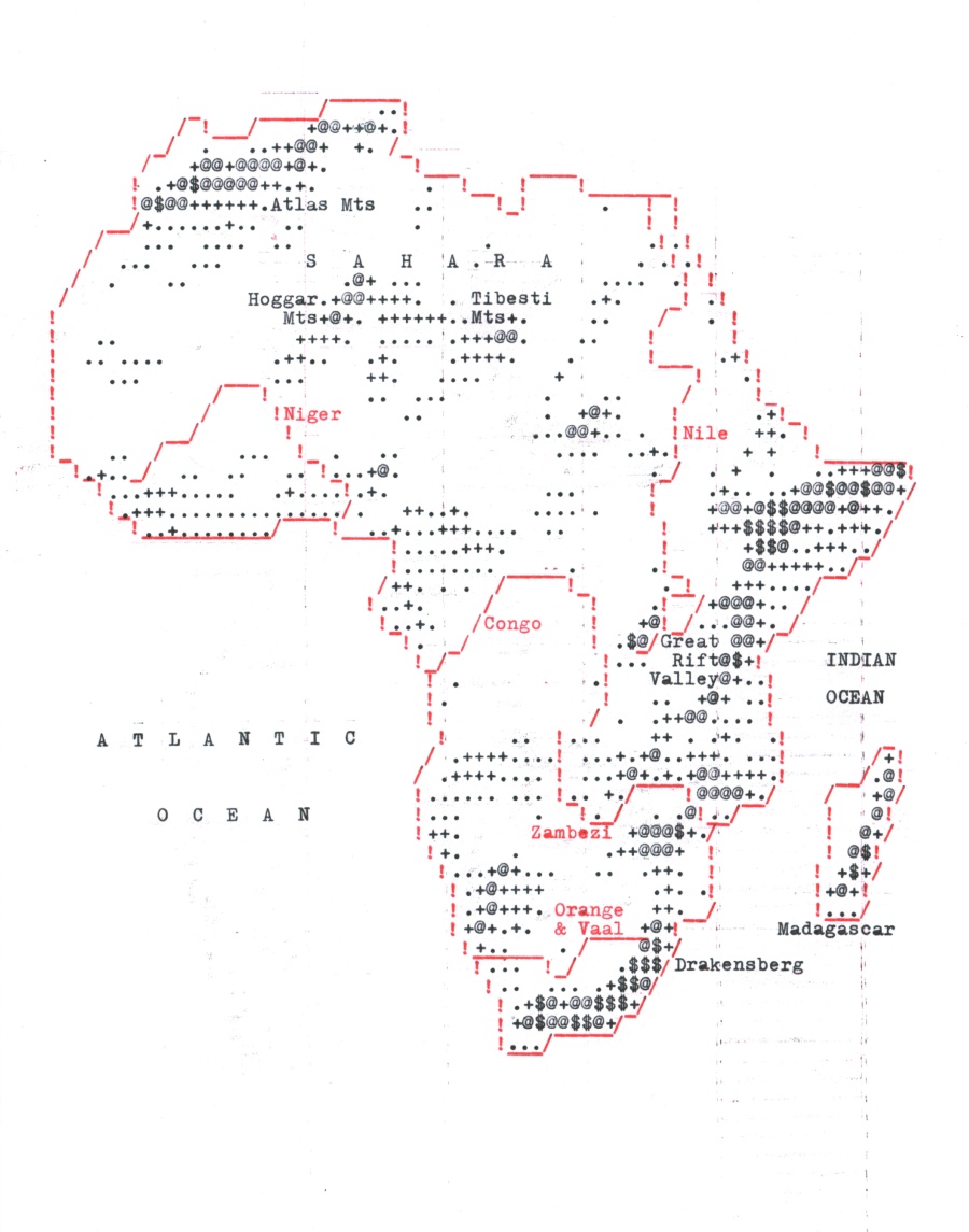
This time I decided to change geographies and map Africa. As with the previous map, I took a DEM and shrank it down to 75 × 60 pixels, then I generated a shaded relief. I did it in Blender, but I turned off the various realistic shadows, as I thought they’d muddle things up. The end result was basically just a simple GIS hillshade.

I did try to compensate for the fact that the image, which had square pixels, would get stretched vertically once it made it to the typewriter. I set my lighting angle to be about 15° off from the typical upper-left light source that is used in shaded relief. However, I think I shifted it 15° in the wrong direction. But the end result seemed to come out well enough.
Once I had the relief, I then classified it into five levels: white, and four shades of grey. While I’d used three shades for my contour map, after having decided five was too many, this time I decided to split the difference.

And then, as before, I converted it to text characters. This time, I used . + @ $ as my set of shades.
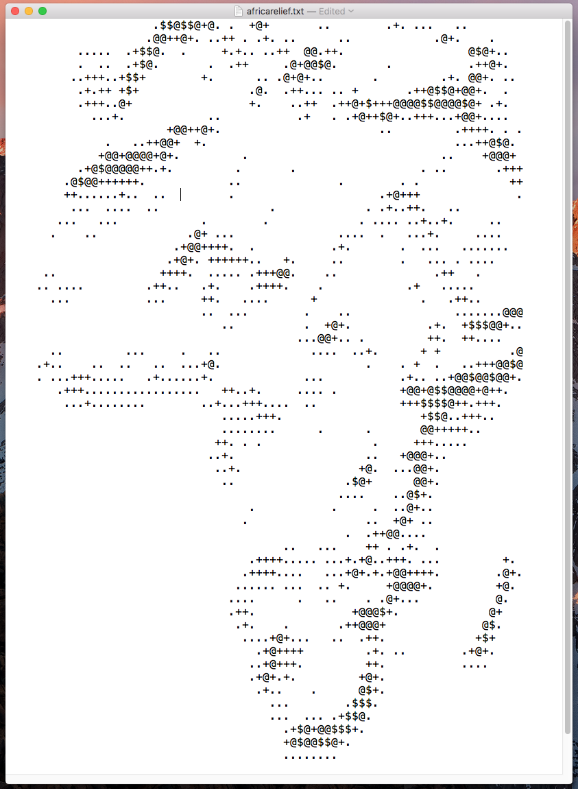
I brought this into Illustrator and added it to the same planning grid that I’d developed for my first map. I also brought in more Natural Earth data so that I could include a coastline and some rivers. The relief would be in shades of black, and the other features would be in red.

The end result would be a combination of the techniques from the first map (mostly pseudo-vector) and the second map (more raster-y).
I removed bits of the relief that crept into the ocean, and also in order to make space for the rivers and a few labels I decided to cram in. After about three hours, I had the whole thing planned out. I printed my pattern and typed it up. I had a few false starts where I missed or added a character here or there, but after another three or four hours, I finished the third map.
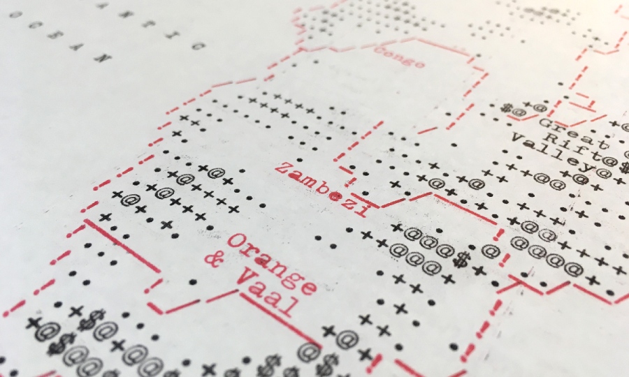
This one has fewer of those “shadows” that accompany the use of the red portion of the ribbon. I spent a lot of time with a piece of scrap paper trying to prevent those, mostly successfully. This map also only involved me making two mistakes that required Wite-Out. I’m clearly getting better, as the first map had probably closer to ten.
The shaded relief is obviously pretty coarse. I think close up it’s more of just an interesting texture, rather than anything that suggests depth. But, it was still fun to try. If you shrink the map, or step far away from it, or blur it, the relief starts to come out a little bit as the eye focuses less on the individual characters and more on the pattern. I think that’s also true of the contour map.

I may do some more maps later on, but I think now that I’ve explored some of the basic challenges of typewriter mapping, I’ve reached a good point to pause in my efforts. Maybe I’ll come back to it some other time, or maybe I’ll get diverted into another novelty use of old technology. Or maybe I’ll spend time doing all the stuff I was supposed to be doing instead of this. We’ll see.
Typewriter Cartography
from https://somethingaboutmaps.wordpress.com/2018/11/26/typewriter-cartography/

